
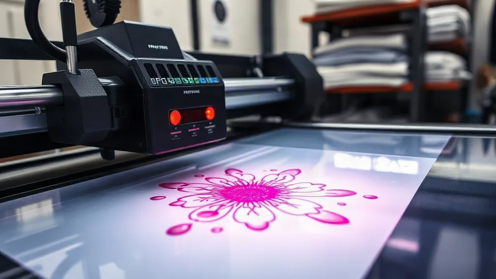
You've probably seen DTF prints that look washed out or blurry, even when the design file was perfect. The culprit is rarely the printer itself. More often, it's a mismatch between how your design software, RIP, and printer handle color and detail. DTF transfers rely on precise ink laydown and powder application, and if any step is off, you lose the crispness and saturation that make DTF stand out. In this guide, we'll walk through the key settings and habits that separate vibrant, sharp prints from dull, muddy ones.
Why Color and Detail Matter in DTF
DTF printing is known for its ability to transfer full-color images onto almost any fabric, including dark cottons and blends. But that versatility comes with a catch: the process involves multiple variables, from ink viscosity to powder melting, and each one can affect the final look. When color and detail are dialed in, you get prints that pop and hold up wash after wash. When they're not, you get faded, fuzzy results that disappoint customers.
The good news is that achieving great color and detail is not about buying the most expensive equipment. It's about understanding the workflow and making consistent, informed choices. Let's break it down.
The Role of ICC Profiles in DTF Printing
ICC profiles are the foundation of accurate color reproduction. They tell your printer how to translate the colors in your design file into the specific ink and substrate combination you're using. Without a proper profile, your printer is essentially guessing, and the results will vary wildly.
Why Generic Profiles Fall Short
Many RIP software packages come with generic profiles for DTF, but these are often developed for a particular ink set and film combination. If you're using a different brand of ink or film, the colors can shift. Investing in a custom ICC profile for your specific setup is one of the best ways to ensure consistent, vibrant output.
How to Get a Custom Profile
You can create a custom profile using a spectrophotometer and profiling software, or you can hire a service to do it for you. Many ink manufacturers offer profiling services when you buy their ink. Once you have a profile, make sure it's properly installed and selected in your RIP. Also, remember to recalibrate periodically, especially if you change ink batches or film types.
RIP Settings That Affect Detail and Color
Your RIP software is the control center for how your printer lays down ink. The settings you choose here have a direct impact on both color vibrancy and detail sharpness.
Resolution and Dot Size
Higher resolution settings (like 1440 dpi) produce finer detail, but they also slow down printing and use more ink. For most DTF work, 720 dpi is a good balance between speed and quality, but if your design has intricate details or small text, bumping up to 1440 dpi can make a noticeable difference. Similarly, variable dot size settings can help produce smoother gradients and finer details.
Ink Limits and Color Gamut
Ink limits control how much ink is applied to the film. Too much ink can cause bleeding, poor powder adhesion, and a stiff feel. Too little ink results in washed-out colors. Your ICC profile usually sets these limits, but you can fine-tune them in the RIP. Start with the profile's recommended settings and adjust only if you see issues. For vibrant colors, ensure your profile is set to maximize the color gamut without exceeding the ink limit that your powder can handle.
Ink and Powder: The Dynamic Duo
The ink you use and the powder you apply work together to create the final transfer. If either is off, color and detail suffer.
Choosing Quality Inks
Not all DTF inks are created equal. Cheap inks may clog printheads, produce inconsistent color, or fade quickly. Look for inks that are specifically formulated for DTF and have a reputation for vibrant color and reliability. Also, keep your ink system clean and maintained to prevent clogs that can cause missing nozzles and banding.
Powder Application Best Practices
Powder is what makes the transfer adhesive, and it also affects the feel and durability of the print. Apply powder evenly and shake off excess before curing. A thin, even layer ensures that the ink cures properly and the detail remains sharp. Too much powder can obscure fine lines and create a rough texture.
Film Selection and Handling
The film you print on plays a role in how detail is rendered. Matte film tends to hold ink better and produce sharper details, while glossy film can sometimes cause ink to spread. Always store film in a clean, dry environment and handle it by the edges to avoid contamination.
Testing and Troubleshooting
Even with the best settings, things can go wrong. Regular test prints help you catch issues early. Print a test image with a range of colors and fine details, and inspect it closely. If you notice banding, missing colors, or blurry edges, check your printhead, ink levels, and profile settings. Sometimes a simple nozzle check and cleaning can resolve the problem.
Finding Reliable DTF transfers near me
If you're outsourcing your DTF printing, choosing the right supplier is crucial for consistent color and detail. Look for providers who use quality inks, maintain their equipment, and offer samples so you can verify the output. Reading reviews and asking about their quality control processes can save you from disappointing results. A good supplier will be transparent about their workflow and happy to answer your questions.
Advanced Tips for Pros
- Use a color management workflow that includes soft-proofing to preview how colors will look when printed.
- Keep a log of settings for each job type so you can replicate success.
- Regularly update your RIP software and printer firmware to benefit from improvements.
- Consider investing in a higher-end printer if you frequently need ultra-fine detail.
Frequently Asked Questions
How often should I update my ICC profile?
It's a good idea to update your profile whenever you change ink brands, film types, or after significant printer maintenance. Also, recalibrate every few months to account for minor drifts.
Can I use the same settings for light and dark garments?
Yes, DTF transfers are printed on film and then pressed onto the garment, so the garment color doesn't affect the printing process. However, you may need to adjust pressing settings for different fabrics.
What causes blurry edges in DTF prints?
Blurry edges can result from excessive ink, poor film quality, or incorrect powder application. Ensure your ink limits are set correctly, use high-quality film, and apply powder evenly.
How do I prevent color fading after washing?
Use quality inks and ensure proper curing of the powder. Also, follow the garment care instructions, such as washing inside out in cold water and avoiding harsh detergents.
Is it worth investing in a spectrophotometer for profiling?
If you do a high volume of DTF printing and demand consistent color, a spectrophotometer can pay for itself by reducing waste and reprints. For occasional use, outsourcing profiling is more cost-effective.